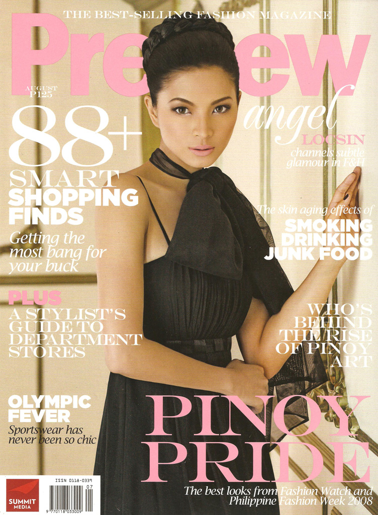
(Click the pictures to supersize :-D)
__
A day before I bought preview, my brother and I tried to guess who will be on the cover. I jokingly guessed Marian Rivera. Again. hehe He replied, maybe Angel Locsin? Ting!! Do you know the tagalog saying "nag dilang-anghel"? Man, so predictable! I still give my kudos for Preview for at least making good covers. Aside from the 'always celebs and stars and now predictable' cover girl selection, they seem to be too flawless it almost becomes a flaw. Too polished? To restrained bordering on stiff? US Vogue isdatchu? I remember a post of Nagali Manila about how Preview is like the US Vogue of Philippine Magazines (because the models are always manicured or something like that)?
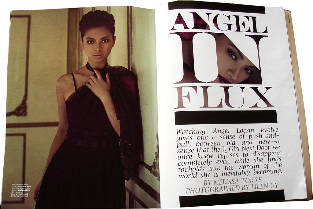
But the editorial was really nice. Are those black blocks giving you a hint of Vogue Paree? hehe
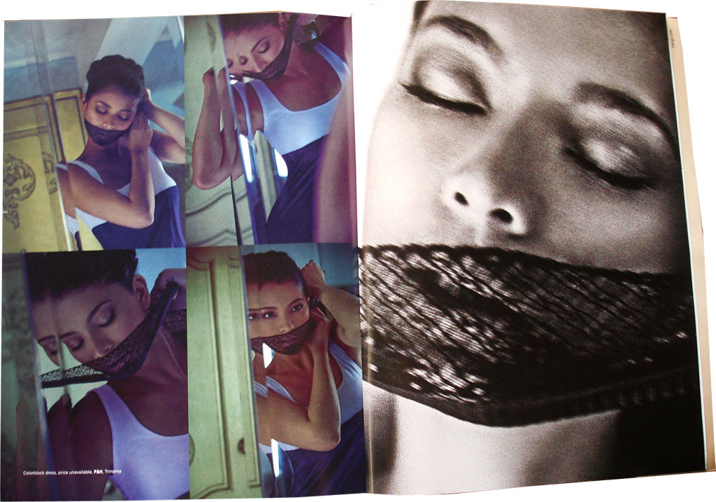
Louis Vuitton/Richard Prince nurse is that you? hehe I think it's good. Their good visuals and creative output make up for the 'always celebs and stars and now predictable' cover girls.
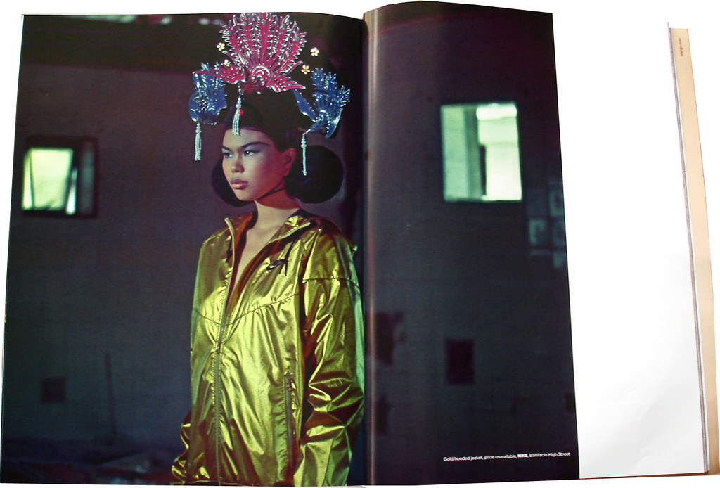
The olympics/sportswear/08 08 08 special was stunning. If the cover photo was from this ed, it could've been fiercer. Ah, yes, the saleability. Of course...
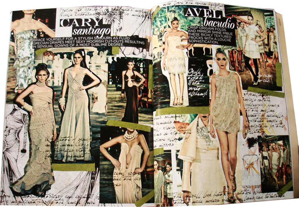

The Fahion Watch special was fantastic too! (I'm pertaining to the design, look and feel.) I didn't see a credit on who did it (except for the photos, which were shot by Daniel Tan and compiled by Mariane Perez), so kudos to whoever did the thing. As for the designers featured, they did well too. (Anyway, why do we have two fashion shows/events? Why do we have Philippine Fashion Week AND Fashion Watch?)
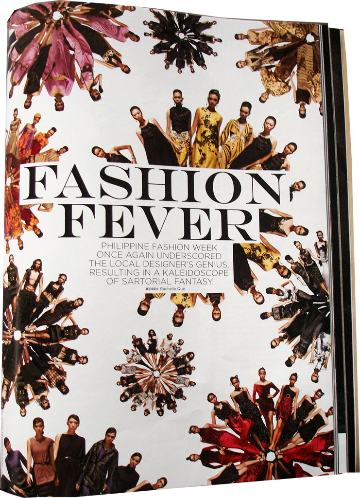
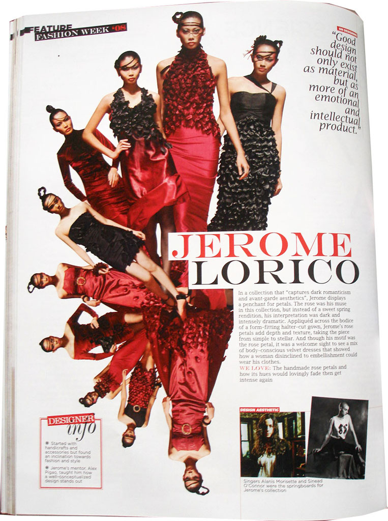
The same with the Fashion Week 08 feature. But it's kind of hard to look at the spiraling set up of the photos. In daring design choices like this, there is always a compromise, no?
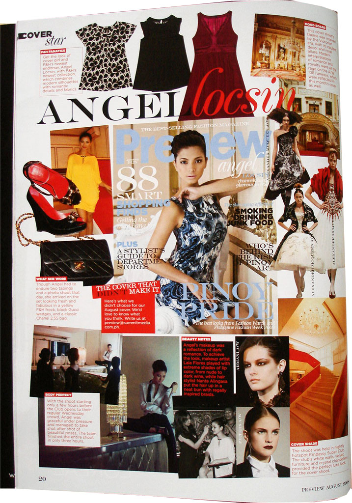

(Left photo: This issue is one of the few issues where I actually liked the cover that didn't make it) Mmmm, this depends on the person's preference, but IMHO, the way the photos are laid out and the use of a lot of different fonts (in some pages) can be a bit chaotic and tiring for the eyes. Maybe considering the use of negative space and overall flow would improve it.
Preview always gives something nice and almost, if not always perfect stuff, but 'nice and almost, if not always perfect stuff' always can border into something boring and predictable. This issue was not half bad, but...surprise us Preview!
__
PS. Let's bet! Who do you think will be on their next issue's cover? Me, I think it'll be
Scans by Edrick


No comments:
Post a Comment