I first picked "Automobiles" but then my classmate (ok I admit, me too!) wanted something else so we had a deal and switched themes. My new theme now is "Men's Fashion". Lucky, no? But I initially wanted something else cause you know, Men's Fashion is quite my cup of tea and therefore easily just inside my comfort zone. The daring in me wanted something else, but I was pretty sure it would be extra difficult if I got the "Gossip mag". hahah!
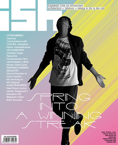
The magazine I used as a reference:
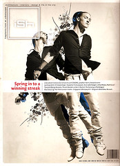


iSh Magazine (Singapore) is not exactly a Men's fashion magazine, but that particular issue had some and, well, it got an ok! :-)
The difficult part is shooting the cover...becuase it had to be us!! I didn't really like this idea because I'm not exactly your male model/cover model material but.....I got to do what I got to do. Fast forward many many months of working and efforting and (life-required) bumps later...my final cover:
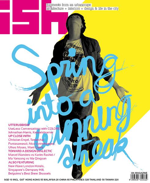
This is one of my favorite works. Plus I super enjoyed the whole process. While working on this one was not without any difficulties, I can probably say that this particular plate was one of the easiest (and by easy I mean stress being shadowed by excitement and happiness :-D ). Things really are relatively easier when you like what you are doing.
We had to submit 3 (actually 2, I found out later) variations of the final photo. I submitted 4! 3 variations with one having another 'half variation'. Here are the ones that didn't make it:
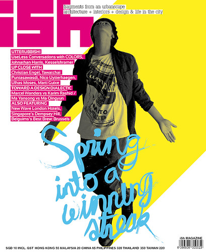
The 'half variation' of the chosen cover
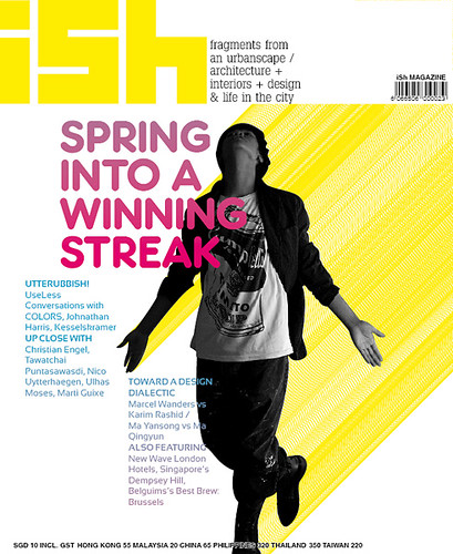
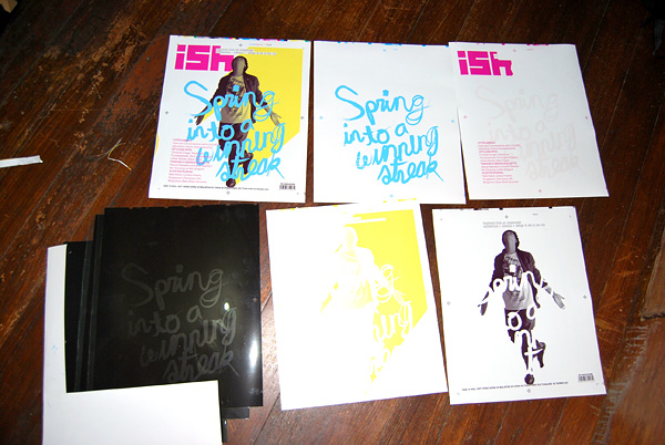
The final chosen cover then should be printed and processed—negatives, CMYK proofs and all; this is where things got complicated. Thank goodness I live just a few steps away from a publishing house...while it was not super easy to finish all the printing and processing, at least I didn't have to go far :-). I learned some things just by looking at what they were doing but there's still so much to learn! And I'm more learning by doing kind of person so I didn't really pick up a lot (like I would not be able to do the processing all by myself). Anyway, here's the printed version:
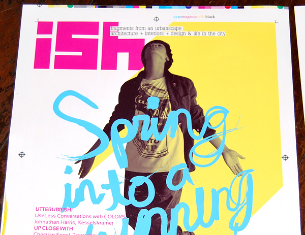
Direk, close up please:
All is well that ends well.


Nice. Is the "Spring into a winning streak" a font or did you write it yourself?
ReplyDeletethanks! yes, i wrote that one myself
ReplyDeleteikaw na ang cover model. haha... i like!
ReplyDeletebut i didn't have a choice! cover moddle by force! hahaha!!
ReplyDelete