__
I've never been this inspired by T3. The redesign and the return of the manorexic and terrific editor that is Vince Sales excited me. Not that the other ed is not-so of course. Although I'm pretty sure the culprit of this redesign are those people at the T3 HQ in UK, I have to say hurrah to the new look! Here's why...

Here's Angel Locsin looking kinda plump. Kidding :-) This is the 50th golden issue (not anniversary ok) I don't exactly know if i should be happy or what. The cover is ok and it's not ok. Get it? It's the 50th for goodness sakes. haha! They should've made it fiercer and awesomer. Ok is really not happy 50th issue. But I have to say..the printing is terrific!

Isn't is good? I love the redesign. The past redesigns have been quite..meh. I mean when they redesigned the mag many many issues ago, I felt quite incomplete (nge) and missing the old look. But look at you today, it looks like somebody went to the Dra. Vicky Belo Clinic of magazines!

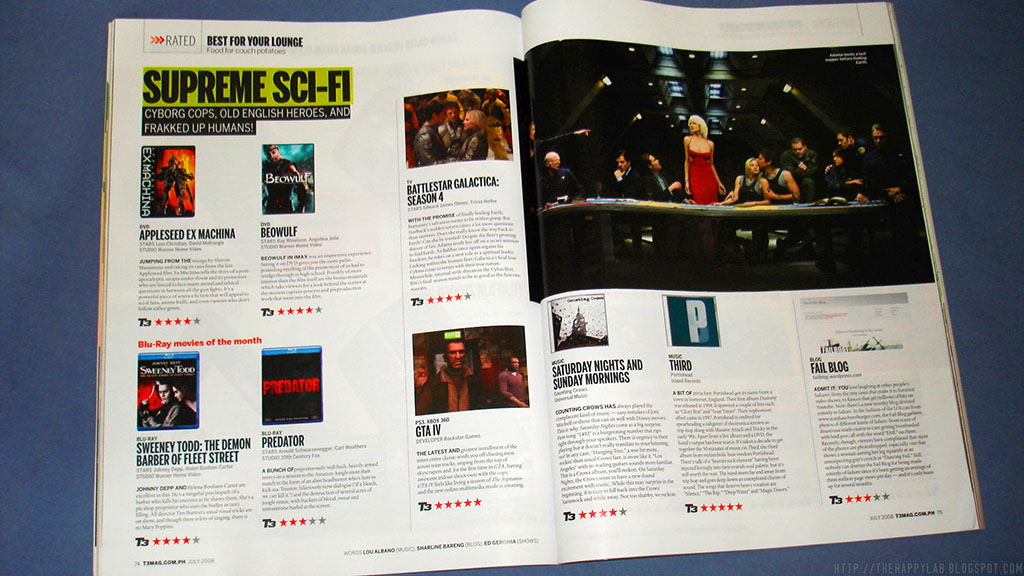
Isn't it lovely? I love the way the texts and images were laid out. And the fonts! So Beautiful and sexy. How can fonts be beautiful and sexy?

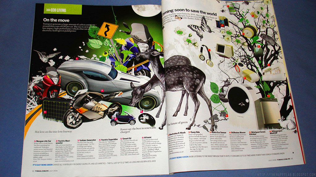
Isn't it beautiful? So beautiful it's so delicious. So delicious I want to eat it. The illustrations (sorry, forgot who did it, check later) were really nice!

This is probably my favorite page from this issue. Or, maybe, since issue 1! LOL @ "Laptops so skinny, they've been diagnosed with eating disorders". I think i have a thing for thought/dialogue bubbles...
The page after...

But...

If there's another thing I didn't like about this issue (aside from the blandtastic—kidding!—cover) it is that the transition from the regular sections/departments to the reviews were quite abrupt (see photo above). I know that it's really crazy to put the disclaimers, notes etc they always had every issue but, I'm sure, just like new visitors at blogs, mags have new readers too. Or they should've put something to separate the reviews from the departments/sections. Oh, yes, page count. Of course.
There you have it!
The articles and reviews were, as always, nice. But Lourd de Veyra's column is missing! Maybe they decided that one column/opinion, either from Butch Dalisay or him is enough each month. As they say, you cannot have it all..
Plus there's one more page and feature I love but apparently it's missing. I'll post it later if I find it.
__
Cover Scan/Photos by Edrick


i like the eco living spread :D
ReplyDelete