

Issue 2 is out now!!
__
The long wait is so finally over. After almost 7 months of waiting...it's finally here. Seven months because the moment I finished reading it, I wanted to get the next one already. Hah!
Sneak peeks and my 10 cents' worth will be up later.
(I know i know, I still have the Preview stuff to post..)
*UPDATE 5/27 (08)*
This edit is quite late, I know. We had a photoshoot today, and I read all the blogs with reckless abandon the other day..oh so much to do so little time. hehe I don't think I have post/info hungry readers here much, so why the hurry? hehe
Anyway...
I haven't read the whole thing yet so I can't say much. I used to read everything from cover to freakin cover. But love re-reading magazines so by not reading everything in one seating, I find little surprises every time. But at least I can give a little comment here and there. Kaya nga 10 cents' worth, onti lang. Joke!
Let's start with the nega stuff, but read my disclaimer first: I love Imagine unconditionally and I already pledged allegiance to Imagine's flag so there. Food won't be so delicious without a little salt right??
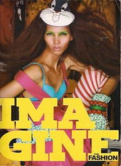
The cover is beautiful and Jo-Ann Bitagcol really worked it. But, don't you think it kinda looks like the first issue?
Meanwhile, eat some eye sample candy (free taste??) with these sneakies I have so far. (You peeping tom. Just buy the magazine already! hahaha) And don't forget to supersize! Just click the pictures...
The cover without the mast head
The long wait is so finally over. After almost 7 months of waiting...it's finally here. Seven months because the moment I finished reading it, I wanted to get the next one already. Hah!
(I know i know, I still have the Preview stuff to post..)
*UPDATE 5/27 (08)*
This edit is quite late, I know. We had a photoshoot today, and I read all the blogs with reckless abandon the other day..oh so much to do so little time. hehe I don't think I have post/info hungry readers here much, so why the hurry? hehe
Anyway...
I haven't read the whole thing yet so I can't say much. I used to read everything from cover to freakin cover. But love re-reading magazines so by not reading everything in one seating, I find little surprises every time. But at least I can give a little comment here and there. Kaya nga 10 cents' worth, onti lang. Joke!
Let's start with the nega stuff, but read my disclaimer first: I love Imagine unconditionally and I already pledged allegiance to Imagine's flag so there. Food won't be so delicious without a little salt right??
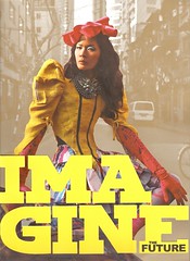
The cover is beautiful and Jo-Ann Bitagcol really worked it. But, don't you think it kinda looks like the first issue?
Issues 1 (L) & 2 (R)
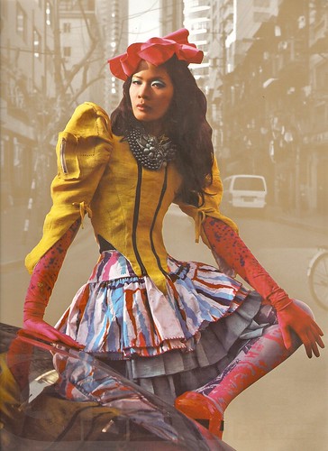
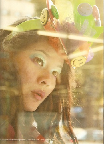
The look and feel...the colors...it's like a part two. Just a bit unsaturated...less vividey. No surprise much because the cover was shot again by Mark Nicdao, the same photographer who did the first issue. Not that it's bad or something, but, I quite expected something different. Look inside and really feel the part two-ness of it. (Click here and here to see the some pics of the previous issue.) Also, I found the new font choices to be, a teeny tiny bit distracting. And why Arial? Helvetica looks sexier and sans-serifer to me; I'm quite crazy about type and typhography so these things matter to me. I know, haha. Distracting because it's quite inconsistent, not distracting because it's ugly or whatever. Check out the previous one and see what I mean. If you'd ask me, they should've stuck to the old one. Ok, so what else? Most of the editorials were so photoshopped and post-produced (wengk, what's that?) it quite looked like Imagine the Power of Photoshop. Haha! JK. There's nothing wrong with a bit of digital imagery here but it kindof makes me look for good 'ol pure classic (fierce) photography. They have it naman, but it's not (quite) enough. Bitin!! I still have some nega stuff to say, but it's not super important, just my opinion and personal biases. hihi
Let's hear the good stuff! yay! Although the cover looks part-two-ish, it's still really nice. Also, I'm quite impressed with what they came up with, over all. I heard a few months ago that issue two would be Imagine the Future so, by default, futuristic images and ideas sprung up my mind. Metallic! Shine! Shimmer! Sleek! Contructed! etc. But they came up with this, deconstucted, organic (read: Eairth), raw, end-of-the-world-ish, dark-ish stuff. Remember Episode 7 in Project Runway 1 where the theme is to design a collection for the year 2055?? That's pretty much what I thought when I saw the stuff inside. I really liked the fashion editorials they did, although, as said earlier, they're a bit too over-done? (bit-over? oxymoron much?) As my friend described it, it's very 'conceptual'. But that should be fine because that's how they interpreted 'futuristic'; they just stuck to their theme. Oh, well, can't have it all! haha The interviews and arcticles were really nice too, especially the one with Paolo Raymundo and the article about Amelia magazine and the collaboration feature that they did, and a whole lot more. Oh, just get it already. :-D
Probably, I'm not just a big fan of over-post-prod'n or super duper conceptual digital imagery that's why it's didn't appeal much to me**. But nevertheless, it's a really good issue and it quenched my thirst for something new, fresh, OOTB and inspiring. If I could only show everything here to you but it's 1)impractical and painstaking 2)unfair? it just got released so...
Your P300 (about US$7) is worth it, especially if you're big on sfx. hihihi Congratulations! I hope I can OJT for them someday...
__
Meanwhile, eat some eye sample candy (free taste??) with these sneakies I have so far. (You peeping tom. Just buy the magazine already! hahaha) And don't forget to supersize! Just click the pictures...
The cover without the mast head
Fee-yas
More sneak peek doki-dokis:

2kg (4lbs) of super inspiration !!

Happy Fiesta

Fierce

@ CSB no??

Lacroixness
2kg (4lbs) of super inspiration !!
Happy Fiesta
Fierce
@ CSB no??
Lacroixness
** Or probably because of the fact that I read it outside the store, standing with a heavy weight lappy i'm carying behind. Stress! Dang Fully Booked - they don't have chairs for customers like in Power Books, where you can just sit and read whatever you want/something you bought.
PS: This week is Philippine Fashion Week and I really want to go there. I want to see how it looks like and WWWWH. If we only had s style.com.ph... Or maybe the fashpack / BB / CVS can shoot some stuff and blog about it? hehehe :-)
LAST: For those people abroad who are interested with Imagine, or want to know more about it, click here.


wow what magazine is that? it really looks good!
ReplyDeleteit really is! it's a filipino fashion/art/design/etc magazine. i don't think they have a website yet though..
ReplyDelete